Enlarge
/
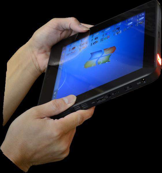
The Nexus 10.
Andrew Cunningham
reader comments
141
with 96 posters participating, including story author
Share this story
Share on Facebook
Share on Twitter
Share on Reddit
I've never been tempted to buy a large widescreen tablet. They're good at certain things, but they're too wide for everything onscreen to be reachable if you're holding it with both hands. They're too tall for portrait mode to be comfortable for long stretches. One-handed use is generally tolerable at best. Smaller widescreen tablets like the Nexus 7 are nice because they're closer in size and heft to books, but 10-inch-and-up widescreen tablets have always been too gawky for my taste.
Which brings us to
Google and Samsung's Nexus 10
. This tablet replaced
the underwhelming Motorola Xoom
in late 2012, and it was the Android ecosystem's first answer to the high-density Retina display Apple had added to the iPad
earlier that year
. Its hardware was perfectly good then and it remains solid now—it has aged much better than the old Nexus 7—but hardware was never the Nexus 10's problem.
The problem two years ago was that the Android ecosystem was light on good tablet apps. There wasn't a ton to do with that big screen, which meant there wasn't much incentive to choose the Nexus 10 over an iPad or a smaller Android tablet. In examining Lollipop on the Nexus 10, our biggest questions are about the ways the redesigned OS and apps make use of that extra space.
Performance: Nothing to see here
Further Reading
Lollipop on the 2012 Nexus 7: Not great, but not much worse
The Nexus 10's hardware has aged much better than the 2012 Nexus 7's. Samsung usually uses top-end flash memory in its devices, so the tablet doesn't suffer from the smaller tablet's NAND-related problems. It was also one of the first tablets to ship with an Exynos 5 SoC, which used a pretty fast dual-core Cortex A15-based CPU and a GPU that sits somewhere between the iPad 3 and iPad 4 in performance.
Our
look at the old Nexus 7
showed that most apps don't slow down significantly in the jump from KitKat to Lollipop and the Nexus 10 still glides along pretty smoothly most of the time. You'll run into hitches occasionally, places where animations will stutter momentarily or an app will take an extra beat to respond to input, but it's not the chronic problem that it is on the old Nexus 7. This is behavior that was present in KitKat, too, so we wouldn't blame the software—we're inclined to attribute it to the GPU, which is OK-not-great at driving a 2560×1600 display panel.
There's no need to compare app launch times in Lollipop and KitKat on this tablet—just know that performance isn't a problem here. If you're happy with how your Nexus 10 is doing with KitKat, you'll be equally happy with it after updating to Lollipop. As in our 2012 Nexus 7, our battery life tests showed Android 4.4 and 5.0 getting roughly equal amounts of runtime, though Project Volta may still end up getting you a little extra battery life in actual everyday use.
Wasted widescreen
Enlarge
/
The "old" Android tablet UI on a Motorola Xoom running Jelly Bean. Google has been backing away from this interface over the last two years.
Andrew Cunningham
The Motorola Xoom was the first Android tablet with a version of Android on it built specifically for tablets, and Google had built an all-new interface to accommodate the larger screens. It took the stuff at the top and bottom of the screen on Android phones and put it all in the four corners of the screen instead—you had the software navigation buttons in the lower-left corner, notifications and status icons in the lower-right, the app drawer in the upper-right corner, and (as of Android 4.1) Google Now in the upper-left corner. The "recent apps" menu popped out on the left side of the screen instead of the center.
Advertisement
The Nexus 10 took 10-inch tablets back to the "blown-up phone" version of the UI, where buttons and other UI stuff was all put in the center of the screen. This makes using a 10-inch tablet the same as using a 7-inch tablet or a phone, which is good for consistency, but in retrospect it was a big step backward for widescreen tablets. The old interface put everything at the edges of the screen where your thumbs could easily reach them. The new one often requires the pointer finger of one of your hands or some serious thumb-stretching.
Further Reading
Android 5.0 Lollipop, thoroughly reviewed
If anything, Lollipop takes another step backward here. You used to be able to
swipe down on the left side of the screen
to see your notifications and
the right side of the screen
to see the Quick Settings, and now those two menus have been unified and placed right in the center of the screen. The Nexus 10 is the most comfortable to use if it's lying flat on a table or stand and Lollipop does nothing to help you out there.
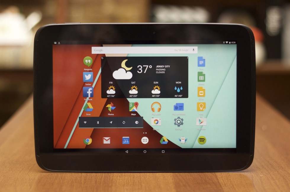
Our biggest problem is the way apps look (1) on a screen this large and (2) in landscape mode. Even Google's first-party apps don't make great use of this space in their Lollipop and Material Design updates. Basic building blocks like the Home and Google Now screens (we've installed the Google Now Launcher on our Nexus 10, though it's not included by default) have big swaths of completely useless space to their left and right. The Settings app is mostly a big, white field with a few buttons in it.
The Home screen. There's a fair amount of empty space to either side of the icons.
You'll see that often throughout the UI. There's a bunch of empty space to either side of these Google Now cards too.
...and the Settings screen...
...and the center-aligned Notification Center and Quick Settings shade.
Even flipped into portrait mode, things just look too stretched out on the Nexus 10's big screen.
The Nexus 9 is less wide in landscape mode and works more comfortably in portrait mode, so you won't notice these kinds of software issues as much on the newer tablet.
Remember, it didn't used to look like this—in Android 4.x the list of settings was in a column on the left and the actual settings themselves appeared in a separate pane on the right. In Android 5.0, it looks and works just like it does on a phone. Compared to the more comfortable 4:3 Nexus 9, things on the 16:10 Nexus 10 just look stretched out a lot of the time.
Google's apps themselves are a mixed bag, ranging from "pretty great actually" to "as bad as anything third-parties are doing." The worst offenders are the apps like Hangouts and Contacts, which plunk smallish buttons down into a vast sea of whitespace. Move away from the core preinstalled Google Apps and things can get downright laughable—the default landscape view in the Android Wear app shows most of a gigantic picture of the watch you're using. You have to scroll down to see any of the settings. Read
Google's developer guidelines for developing Android tablet user interfaces
and then look at these screenshots—Google is breaking tons of its own rules.
This is straight from Google's list of tablet design guidelines. Developers are asked to avoid excessive whitespace to too-long lines of text.
The Hangouts app. Note the excessive whitespace.
Same for the Contacts app. There's a lot of wasted real estate here.
The problem extends into the core OS, too. Here's one of the Settings panes.
And another.
Here's Android 4.1 on the Xoom again—this two-column Settings design persisted all the way through KitKat, but it's no more.
Android Wear on the Nexus 10. Um.
On a Nexus 5. This is what it's supposed to look like—it's very much designed for portrait mode.
A step up from the worst apps are the "acceptable" apps like Google Drive, Docs, Sheets, and Slides; Google Keep; Google Calendar; Google Maps; or Google+ Photos. These apps do nothing in particular to look great on a big tablet screen (they lack any kind of multi-pane layout, for example), but they at least take all the screen space they're given and fill it up with stuff. Most of these apps also support swiping in from the left side of the screen to pop out the "hamburger" menu, a handy navigation option.
Advertisement
Many apps, like Photos and the entire range of Google Drive apps, don't use a multi-column design but they do fill the entire screen with stuff.
Google Keep, another example.
The list of "great" apps is smaller than it ought to be. Chrome is one good app, since it looks basically like it does on a desktop or laptop—it uses all the available screen space and you have lots of room for multiple tabs up top. The best by far is Gmail, which uses a three-column design to support easy switching between accounts, scrolling through your inbox messages, and viewing individual messages. You don't have to tap around to switch between these views—they're all present all the time, and what you can't see on the screen is easily accessed via the hamburger menu.
Gmail is, hands-down, Google's best tablet app. The three-column design makes excellent use of the available screen space.
Some third-parties are doing a nice job with their Android tablet apps. Here's Evernote.
Ditto Netflix.
Eye In Sky Weather, my weather app/widget of choice, uses multiple columns and rows to display lots of information at once without looking too cluttered.
But many apps just look like blown-up phone software. Facebook can show me most of one post on a 10-inch, 2560×1600 screen.
We could move on to third-party apps and complain about them too, but we'd mostly be repeating ourselves since most of them make the same mistakes Google is making. There are a handful of pretty good ones—Evernote, Netflix, Hulu, and Eye In Sky Weather all do a fine job, to name a few—and a whole bunch of them that still look like blown-up phone apps (sup Facebook). None of this is exclusive to Lollipop, but it's unfortunate to see Lollipop and its Material Design apps ignoring so many of the tablet design guidelines that Google itself has published.
Try harder
Enlarge
/
The Nexus 10 is still nice enough hardware, but Lollipop and Material Design don't do it any favors.
Andrew Cunningham
Now, we're not saying that it's necessarily good user interface design to cram each and every screen full of as much stuff as will fit on it. But our chief frustration with the Nexus 10 is exactly the same as it was
two years ago when we reviewed it
. The tablet has a sharp, expansive screen, and Android and its apps do almost nothing useful with it.
Oddly enough, it's Samsung and Touchwiz that do the best job adapting Android to a bigger screen. Split-screen mode and support for widgets that can float on top of the active app give the screen something to do, since it's wide enough to fit two phone apps side-by-side. Standard Android, while excellent at many things, is too content with the yawning empty spaces that surround whatever it is you're looking at.
The fact of the matter is that the majority of Android devices sold are either phones or smallish tablets—a quick look at
Newegg's complete list of Android tablets
shows around 1,200 that are eight inches or smaller. 1,000 of them are 7-inch tablets. An additional 600 tablets are nine inches or larger, and of those only about 400 are 10 or 10.1 inches. Phones and smallish tablets are generally the most comfortable when used in portrait mode, and Lollipop and its Material Design apps reflect that fact.
The Nexus 10 actually runs Lollipop just fine—it's still an attractive-looking OS and performance is as good as it was in KitKat. It's just that there aren't many reasons to use an Android tablet with a screen this large, and if Google isn't willing to make its redesigned OS and apps work great on these big widescreen tablets, why should other developers bother?


